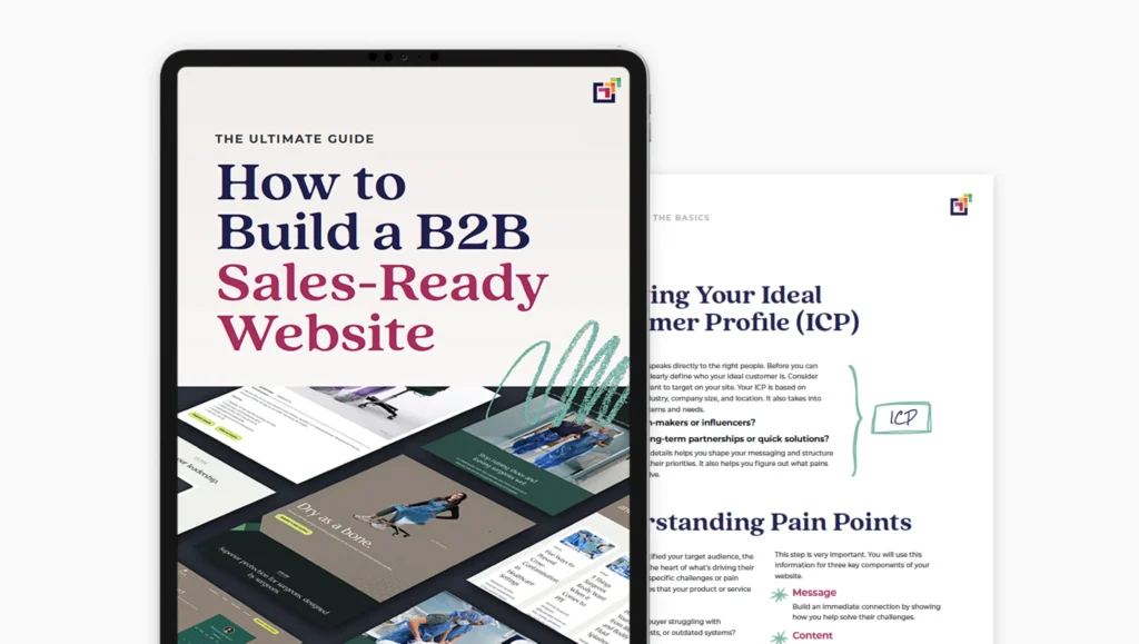
Did you know your website homepage has less than 10 seconds to capture a prospective customer’s attention and convince them you can help them with what they are looking for before they leave to find another site? This shocking truth puts a lot of pressure on you.
So how do you do this exactly?
B2B website design that captures buyers’ attention
How do you ensure your B2B website design captures a potential customer’s attention in less time than it takes to grab a can of soda from the fridge?
It may seem a little bit nebulous and a lot daunting, but there are actually very tangible pieces of information your audience is looking for during this time.
Your website visitors want to know:
- Am I in the right place?
- Is this for me?
- What do you do? Can you help me?
- Why should I choose you over another option?
- Can I trust you?
Your website is, or should be, one of the top investments in your sales strategy. And when done right, it can be your hardest-working salesperson. So you want your website homepage to answer all these questions successfully, and guide your potential client through the buying journey.
You might think, there’s no way someone is going to read all this information in just 10 seconds.
And you’re exactly right!
All of this needs to be accomplished through a combination of factors carefully crafted into one seamless user experience.
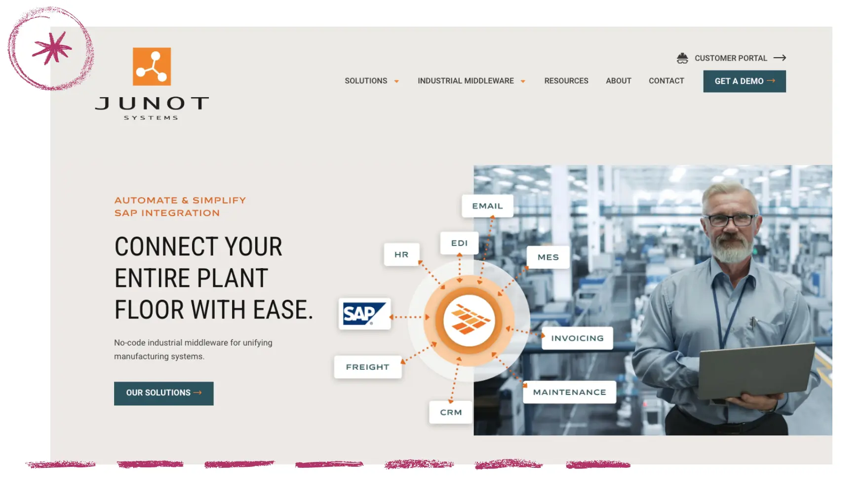
Here are the factors of an effective B2B homepage design:
- Clear, concise copy
- Professional and cohesive design elements
- Strategically placed calls to action
- Quick page load speed
- Secure website experience
What happens if your website doesn’t do these things?
Here’s another hard truth. If people can’t easily figure out if your products or services are right for them, they won’t work to find out. They’ll just leave.
The metric we want to look at here is your website’s engagement rate in Google Analytics. To register as an engaged session, the user must do at least one of the following:
- Actively engage with your website for at least 10 seconds
- Initiate a conversion event (like clicking a button)
- View 2 or more pages
A low website engagement rate is a powerful indicator that your website is not effectively working for you. You want to look for a website engagement rate that’s:
- Above 63% for B2B websites
- Above 71% for B2C websites
How to design a B2B website homepage that converts
Now, let’s dig into the essentials of a website homepage that converts.
1. Create clear, concise copy.
Your target audience is coming to your site in search of something that can help them. Your messaging should read as a dialogue with your prospect, letting them know you understand their pain points and their goals and showing them how you can help them get from point A to point B.
Make it obviously clear what you do and the B2B buyers you help
Right away, your copy should clearly and quickly convey what you do, what you offer, and if you serve a specific demographic. This information should be quickly communicated in a short headline and subhead on your homepage.
Your content MUST be skimmable
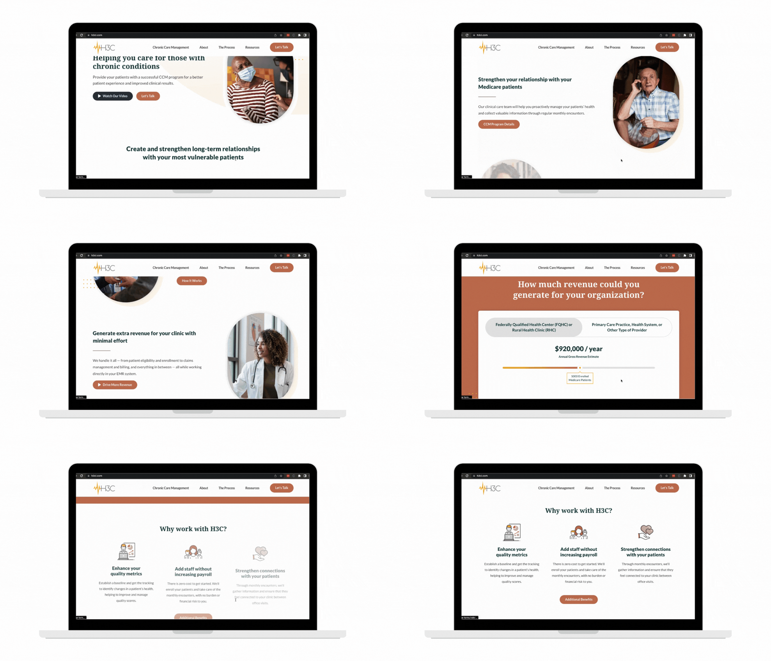
Buyers spend an average of only 5.59 seconds looking at a website’s written content (source). This is just how people navigate the web designs. Now, once they find something of interest, such as a blog post, they will dig in and spend more time digesting your B2B content. But because initially, they scan to quickly assess if your site is for them, it’s absolutely critical that your content is skimmable. This means using the following to break up chunks of content:
- Headlines
- Subheads
- Quotes
- Graphics and illustrations
- Charts and graphs
- Carefully selected images that tell an intentional story
Here’s a great example of skimmable content:
Messaging should prioritize clarity over cleverness
When you have just seconds to communicate, it’s important to prioritize clarity over clever copy. You want to make sure that your message is conveyed quickly, clearly, and without confusion.
As our good friend Donald Miller at Storybrand says, “If you confuse, you’ll lose.” Clever copywriting has its place. On your website, direct and to the point always wins.
2. Showcase your secret sauce
With an endless list of options at their fingertips, website visitors need to know why they should choose you. What sets you apart from every other product or service provider out there? Don’t be afraid to be clear about what sets you apart.
You’ll also want to include a list of differentiators on your homepage.
3. Instill trust through high-quality B2B web design
Today’s online world is rife with scammers and fraud. Your website users want and need to know that:
- You’re a legitimate business
- You’ll deliver on your promise
- They can contact you if they have questions or if there’s an issue
- Other people worked with you or purchased from you successfully
- Your website is secure
This is one of the biggest reasons you need a well-designed website, and it is why a B2B website design agency is worth its weight in gold.
Effective approaches to quickly instill trust in your target audience:
- Minimalist, clean design and consistent branding
- Clear copy, free of misspellings and improper grammar
- Your contact details prominently displayed
- Showcasing customer testimonials, reviews, client logos, and other forms of social proof
- The little lock icon next to your URL
This represents a minimal, basic level of trust, but we encourage you to go beyond that. Set your sights higher to become established as a thought leader in your industry.
Include teasers for 1-3 thought leadership pieces on your homepage for added effectiveness.
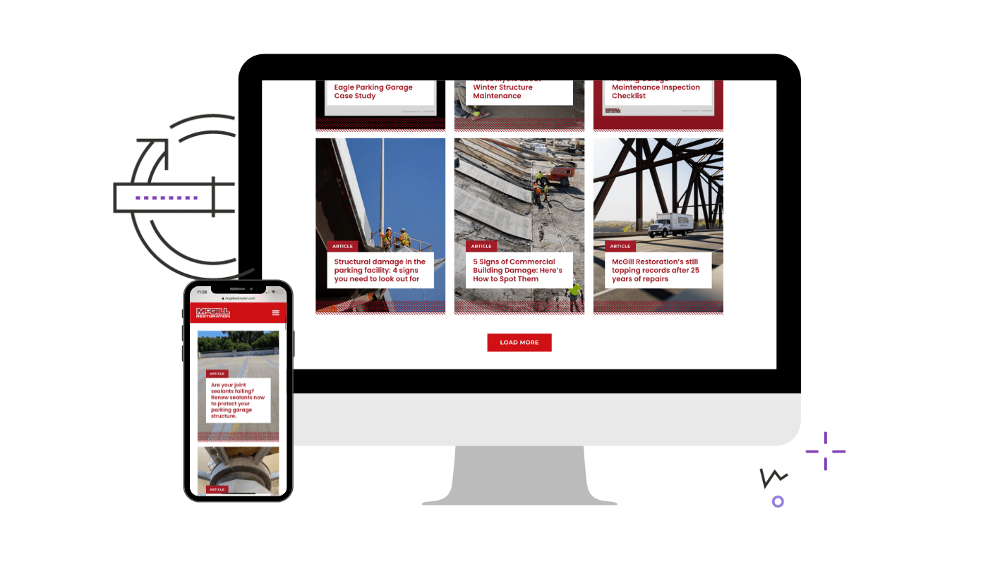
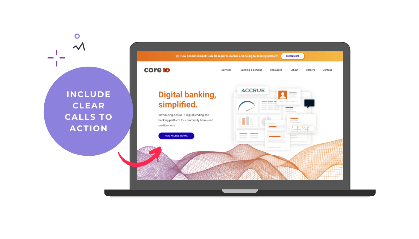
4. Include calls to action and opportunities for conversion
AKA: Buttons, links, chat widgets, and signup forms
The most important factor in having a homepage that increases conversion rates is offering opportunities for conversion! This might seem obvious, but it’s often overlooked. This is where a strategic content strategy mapped to your buyer journey really helps.
By providing links to key information in the right places, you guide buyers to the next step naturally. They immediately find your website and brand helpful, and you ultimately move them to contact sales without friction.
Including a fantastic lead, magnet signup is also one of the best ways to have a homepage that converts visitors into leads and, ultimately, sales and growth for your business.
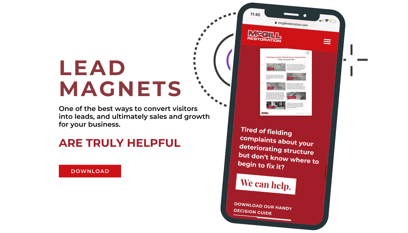
Read: How to design a lead magnet that generates qualified leads?
It’s about them, not you
Remember, your website is about you, but it’s not for you. This is one of the most common mistakes businesses make with their messaging.
A good rule of thumb: Your copy should say ‘you’ more than it says ‘we’.
Is your current website leaving money on the table?
Want to know if your B2B website design is actively losing you leads and sales? Check out our Sales-ready website audit. You’ll get a custom report with recommendations on exactly what you need to update to ensure your site is set up to help you optimize sales.


