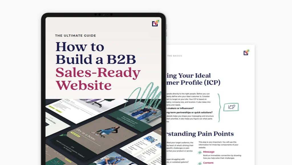
You already have a website, and chances are you spent a pretty penny on it. So it’s a hard pill to swallow when you hear you need to upgrade, redesign — essentially, do better.
When you’re a SaaS business, your site is your storefront. Realistically, there are always going to be repairs and enhancements you must make to any storefront, which, in turn, improves your customers’ experience, right? And ultimately the goals of those enhancements are to bring in more business.
So how does good web design help get you more leads?
1. It inspires confidence
A well-designed site inspires confidence in a company and its products, whereas poor design can cause customers to question the quality of the products and services. Does your site make you look like you could be working from your garage? If your design leaves visitors questioning whether you’re a legitimate business, they might be using that qualification in their decision-making process.
Not to mention, users just like good design! 38% of users will cease interacting with websites if the content or layout is unpleasant to the eye — which means you could be losing leads purely based on your design. So even if you are working from your garage, it’s best not to let your site look like it.
2. It helps communicate your message
Customers need to understand what you do, and great design can help you communicate your message. A well-designed site should guide users through your site and drive them to take the action you want, such as filling out a lead form. This is done by strategically placing copy and visuals but also with the use of color, hierarchy, and white space.
There’s also the question of, can your visitors even see your message? According to the ADA, nearly 1 in 5 people have some sort of disability that could affect their experience online. If your site design doesn’t follow ADA compliance best practices, such as specific use of compliant color combinations, you could be losing leads that simply can’t see your message.
Visitors remember 80% more when information is represented visually, which means if your site consists of mostly text, you could be missing out on leads because visitors aren’t seeing the value in your products or services. Learn more about customer lifecycle marketing and find out if your visitors are struggling to understand your message.
3. It makes Google happy.
Google loves what customers love, which means if you improve your user experience, you can improve your search rankings. Yes, really! Google ranks websites based on many factors aside from keywords, such as quality of content, image optimization, inbound links, site structure, and readability. They may also be using bounce rate, time on site, and pages per visit to determine if users are engaging with your site or simply hightailing it out of there.
4. It improves mobile customer experience
More than ever, users want instant gratification and results, regardless of the device they are on. If visitors experience delays on your site, it’s likely they will find another solution. One study found that just a 1-second delay in load time can result in a 7% decrease in conversion. And poor design such as incorrectly sized images could be slowing your load time.
Having a mobile-optimized experience is an expected standard today; however, I still see so many sites doing this incorrectly. Just because your site adjusts to fit on a mobile device doesn’t mean it’s designed for how a user navigates the web on a mobile device. 57% of customers won’t recommend a business with a poorly designed website on mobile. Not to mention, Google looks at how well your site performs on mobile and can be ranking sites that do higher than others — which in the end can be affecting the number of people finding your site.
OK, what’s this going to cost me?
Many small businesses have challenges fitting great design into their budgets. Hiring a full-time, experienced designer can be expensive, so many opt for younger talent with less experience. But this approach could be hurting your business. Making an investment in great design could mean more for your bottom line.
Great design doesn’t have to be something out of reach for your company. An experienced designer will know how to get things done quickly and what is going to give you the most bang for your buck. You want to stand out, but there is no need to recreate the wheel. Check out any popular SaaS platform and notice their marketing sites all follow a very similar pattern. Why? Because it works. The greats, like Slack, MailChimp, and HubSpot, have done the research and user tests and can be a great place to start for inspiration.
Design is a worthy investment. And done right, small businesses can fit it into their road map. In fact, you could have a whole team of experienced professionals for the price of hiring a marketing director. Learn more about how Peer can help you upgrade your website design to maximize sales.


